I AM A

We Make You Smile

cute

Super cute illustrations on The Observer's Books

illustration, sweetI AM AComment

The Observer’s Books that are a wanted series of vintage books published by the Frederick Warne & Co in the UK from 1937 to 2003. The books cover a large spectrum of topics, from British birds, dogs, cats, caterpillars, astronomy, fishes, house plants, cacti, roses to hobbies including postage stamps, coins, music, British architecture and locations including London, Cotswolds, Devon, Cornwall and Paris. A must have for colour enthusiasts and book lovers.

The series contains 100 titles and are very sort after, both for its vast array of knowledge and the block colour fabric book covers that are great desk and shelfie props, and are frequently seen in styled photography with lifestyle products.

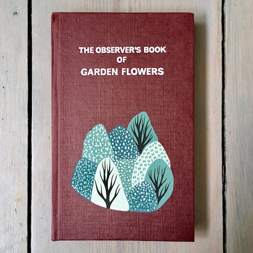
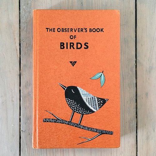
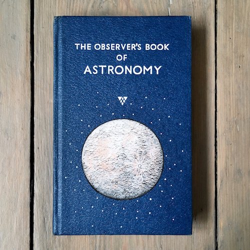
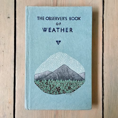
Illustrator Natasha Newton www.natashanewton.com from Suffolk / Surrey has further brought the book series to life, and escalate the books to super cute status by adding her own very pretty modern touch - her original nature / landscape paintings in gouache and acrylic ink to these lovely vintage Observer’s book covers. We agree how Natasha had described her customised book covers as “a work of art” - we HEART these (big time) as it combines our love of books, colour and illustrations.

How To Make Sweetheart Candy Hearts

yum, geekery, funI AM AComment

We love sweetheart candies. The iconic love heart candies with super sweet lovey dovey messages printed on pastel colour shades sweets. We love them so much we’ve created a pencil set inspired by them. With this Candy Heart Generator, you can create your own range of sweetheart candies with your own terms of endearment. Type in your own message, pick a candy heart shade, download the digital version of your treat, and add them to your emails, WhatsApp or text messages and send your own version of these sweets to your loved ones. Our personalised ones would definitely have to include pencils, just because. Totes dentists approved!

P.S. This February 14th, Valentine’s day, there will be a lack of these classic American sweetheart candies. This over 153 year old sweetie, founded since 1866 by US sweet company NECCO is currently under a change of hands of the company. Hence digital versions of these classic conversation heart sweeties are perfect for your sweet nothings. For the British, we have the LOVE HEARTS by sweet company Swizzels - sweet!

Vitamin C for Cute Citrus

yumI AM AComment

These two pieces of homeware that are designed for oranges will make anyone go fruit envy. We are completely goo goo ga ga over these cute faces. Citrus fruits can’t get any more fun with these two orange gadgets around.

The orange basket holder on the left, is an orange fruit holder, “Kantan Reito Mikan Holder“ the most kawaii fruit accessory designed for Japanese oranges- the Mikan fruit, which is like easy peelers satsumas. It is for making frozen orange iced desserts. We think it is perfectly cool to carry our citrus fruits in this holder along with our lunch boxes.

The cute gadget on the right is also designed for the Mikan oranges - an orange juicer. Totes adorbs!

Who says fruits can’t be fun? In our books, Vitamin C is for Cute!

Super Cute Piggy Bags

designI AM AComment

It’s the Year of the Pig this year, and these cute pigs from Kate Spade totally melt our hearts. Our kind of piggy bags ( instead of piggy bags, pun intended ) in all shades of pink. Tickled pink!

5 Best Risograph Colour Charts

design, colourI AM AComment

We have long loved the effects of what risograph can achieve. The imperfections, the gradients, the opacity, the overlaps - love! We have used it for packaging design for our Stationery Gift Boxes for the belly bands and the box liners.

When printing with Risograph (or riso), one of the favourite things we love, apart from the process, the changing of drums (yup we have done it), making the masters, and the effects it can achieve; are the colour charts that each printer would produce.

These colour charts are useful pieces of information from the printers to show the riso colours they have in stock, and also serve as a guide for designers as a source of inspiration on how to set their gradients, line weights, font size etc. It is one of those pieces of paper that definitely tops a colour lover’s hoard list (yes us!), which Marie Kondo may not approve. Hey Marie, if you are reading, we do thank these Riso charts for their service, so, here we are keeping them in digital for now.

Here we have shared some of our favourite Riso colour charts. These colour charts to us are like a window of expression of personalities and styles of each of the print studios:

Popurri, Korea

This is a super fun animated risograph colour chart from Popurri, a risograph studio in Seoul, Korea. We love cute gifs. To make a colour chart with a combination of super quirky illustrations and animate it, this is totally rad! We particularly love the playful messages in the colour chart “I Need A Friend”, and “Draw His New Friend” - that makes our hearts melt, super adorbs.

Super fun animated risograph colour chart Popurri, Korea

InkChaCha, Hong Kong

This clear, precise and simple risograph colour chart shows brilliant examples on colours available by print studio InkChaCha in Hong Kong. This colour guide shows the different effects that can be achieved from riso printing, from swatch samples of matching colour gradients, overlapping different riso colour shades, to brush strokes effects. One of the most comprehensive and detailed colour charts we have come across that works great as a neat reference guide to Risograph printing. Yup, we have a copy of it in the studio and it is definitely one of the items on our hoard list which we will never be able to part with.

Inkchacha Hong Kong Risograph Colour Chart.jpg

Paper Pusher Printworks, Canada

Paper Pusher Printworks is a print studio in Toronto, Canada which is the brainchild of artist / designer J P King. They have produced a really cool and one of the most delicious Risograph chart that is as yum as looking at delicious Pâte de Fruits jelly cubes. This beautiful colour chart not only depicts the risograph colours that are available in the studio but also cleverly shows on the same axis how you can mix and match to create new colour shades, that are not offered as standard risograph shades by overprinting 2 or more colours.

P.S If you are veg lovers like us, note, the type examples in this colour chart is bursting with deliciousness.

Overlapping colours risograph printing colour chart Paper Pusher Printworks, Canada

Calverts CoOp, England

This risograph colour chart from printing cooperation Calverts CoOp in London is a colour chart for graphic design lovers. The colour chart in itself is a piece of brilliant graphic art that encompasses typography, shading, patterns, gradients. It also has a slant of Piet Mondrian in it, less cubism more graphical, with the red, blue, black and yellow colour scheme. Super cool! Apart from this overview colour chart, for each individual colours, they have taken the trouble to show each individual colour they have in stock along with the different effects that can be achieved by changing around the opacity which could be seen via this link.

Calverts Coop London Graphical Risograph Colour Chart

PauseBread Press, China

PauseBread is a riso studio in Shanghai, China. It is both a printing studio, as well as a publisher that publishes its own work and collaborations under the name Banana Fish Books. We love the example of the vibrant colour chart that they have on display on their risograph splash page in their website. It beautifully captures the title of the page “Beauty of Risograph” and something we can resonate with. It’s a lovely colour chart example where they have displayed the colour chart like a piano keyboard; accompanied by details to demonstrate the effects that can be achieved by risograph printing. From depicting the different opacity with the use of a manuscript; highlighting different qualities such as the granular texture that risograph can offer, along with cute graphic footnotes. A very well composed, and a very sweet colour chart - a true beaut and a lovely tune we want to tune into. (Pun intended).

Pausebread Risograph Colour Chart Banana Fish Studio Shanghai

Paper Summer Puddings

paper, yumI AM AComment

It's summer and plenty of berries are in season including strawberries, raspberries, blackberries etc. This has us thinking about summer puddings, something refreshing and fruity!

Summer desserts including gelato, ice lollies, strawberry cake, summer puddings are ideal for the hot weather. We are inspired by this super super cute paper food desserts made by Amsterdam and Paris based graphic designer Charlotte Smith.  Cuteness overload and sugar cravings alert here!

Photos courtesy of Charlotte Smith www.charlottesmith.fr

Korean Cake Palette

yum, colourI AM AComment

Cake for breakfast, cake for lunch, cake for tea, cake at all times. Wonderful dreamiest pastel cake palette and cake shapes. Cherry on top of a cake.

Cake of dreams, found on Instagram from a korean dessert shop 바나나하루키, Banana Table, via instagram account Banana_Haruki